

Programme identity. Clear information. A path to apply.
HKUSustainability Leadership and Governance Programme
A programme website that connects HKU’s sustainability education with a clear visual hierarchy, practical study information and routes to apply.
- Client
- Centre for Civil Society and Governance, The University of Hong Kong
- Industry
- Higher Education
- Our role
- Programme Website
The project
The Sustainability Leadership and Governance Programme (SLGP), offered by the Centre for Civil Society and Governance at The University of Hong Kong, connects sustainability knowledge with leadership across business, government and civil society. The website gives that multidisciplinary programme a distinct digital presence within its university setting.
For a prospective student, the journey is both aspirational and practical: understand the programme’s purpose, meet its academic community, examine study options and decide what to do next. This case brings those needs together through a people-led opening, a clear information hierarchy and a series of recognisable routes into the content.
A hierarchy built around student decisions
The homepage balances an introduction to the programme with the detail needed to explore it seriously. Three design principles connect its different sections.
Lead with the programme’s identity
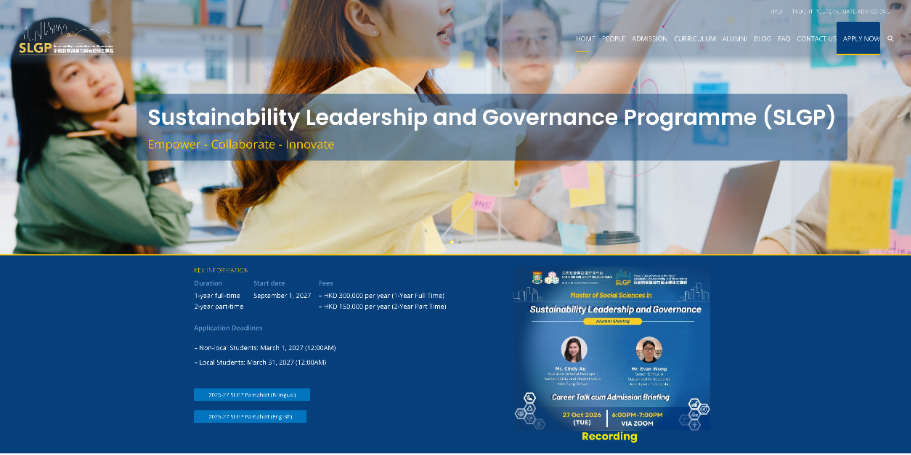
A full-width photograph puts people and collaboration in the opening view. The programme name sits on a translucent blue panel, with a yellow accent beneath it. The treatment makes the identity visible against a busy image while retaining the energy of the photograph.
Keep practical information close
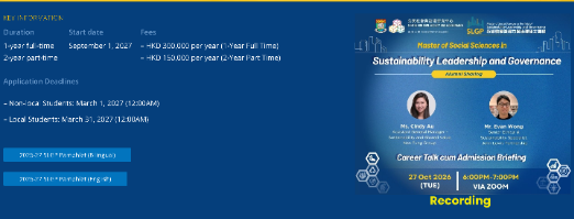
The next band changes from photography to solid blue. Duration, start date, fees and application deadlines are grouped as key information, rather than buried in the introductory text. Programme pamphlets and a recorded briefing offer further ways to explore.
Offer more than one way through
The main navigation names the programme’s core content directly. Later, image-led links revisit the main routes, so a visitor can move from the overall introduction into People, Admission, Curriculum, Alumni, FAQ or Contact without returning to the opening menu.
Making admissions information easy to locate
The blue key-information band gives practical study details a defined place near the top of the page. Short labels separate the categories, while the full-time and part-time options appear together. The visual break is important: this is a different reading task from understanding the programme’s wider ambitions.
Download links sit alongside this summary, and the recording is presented as a separate visual item. The arrangement supports both a quick scan of the essentials and a deeper exploration of the programme, without asking every visitor to follow the same path.
Giving an academic programme a human face
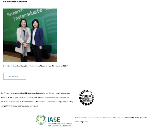
The programme introduction moves into a photograph of its co-directors, followed by professional-context content. This puts people beside the academic proposition instead of leaving the programme as an abstract list of subjects.
Generous white space, blue headings and fine yellow rules carry the visual language through the longer page. The directors’ image and the professional-organisation marks introduce different kinds of content while remaining part of the same overall composition.
Connecting study options with the next step
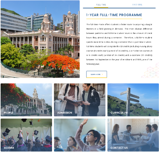
A campus photograph anchors the study-mode section in HKU’s physical setting. Beside it, full-time and part-time labels sit above the programme explanation. The combination connects the institutional context with a practical choice about how to study.
Immediately below, six photographic panels turn the main content areas into a visible set of choices. Consistent sizing, short labels and a repeated grid create a change of pace after the longer text sections. Each panel acts as a doorway to a more specific question.
The Apply Now route remains part of the main navigation, while FAQ and Contact provide alternatives for visitors who need more information first. Exploration and action are therefore connected without reducing the whole experience to an application button.
The outcome
The finished experience brings programme identity, practical study information and academic context into one coherent web presence. Its sequence moves from a distinctive introduction to key facts, people, study modes and deeper content, with a consistent blue-and-yellow visual language throughout.
The value of the design is in that connected structure: visitors can understand what the programme stands for, locate the information relevant to them and choose an appropriate next step. The case demonstrates how an education website can balance institutional credibility with a clear, approachable content journey.
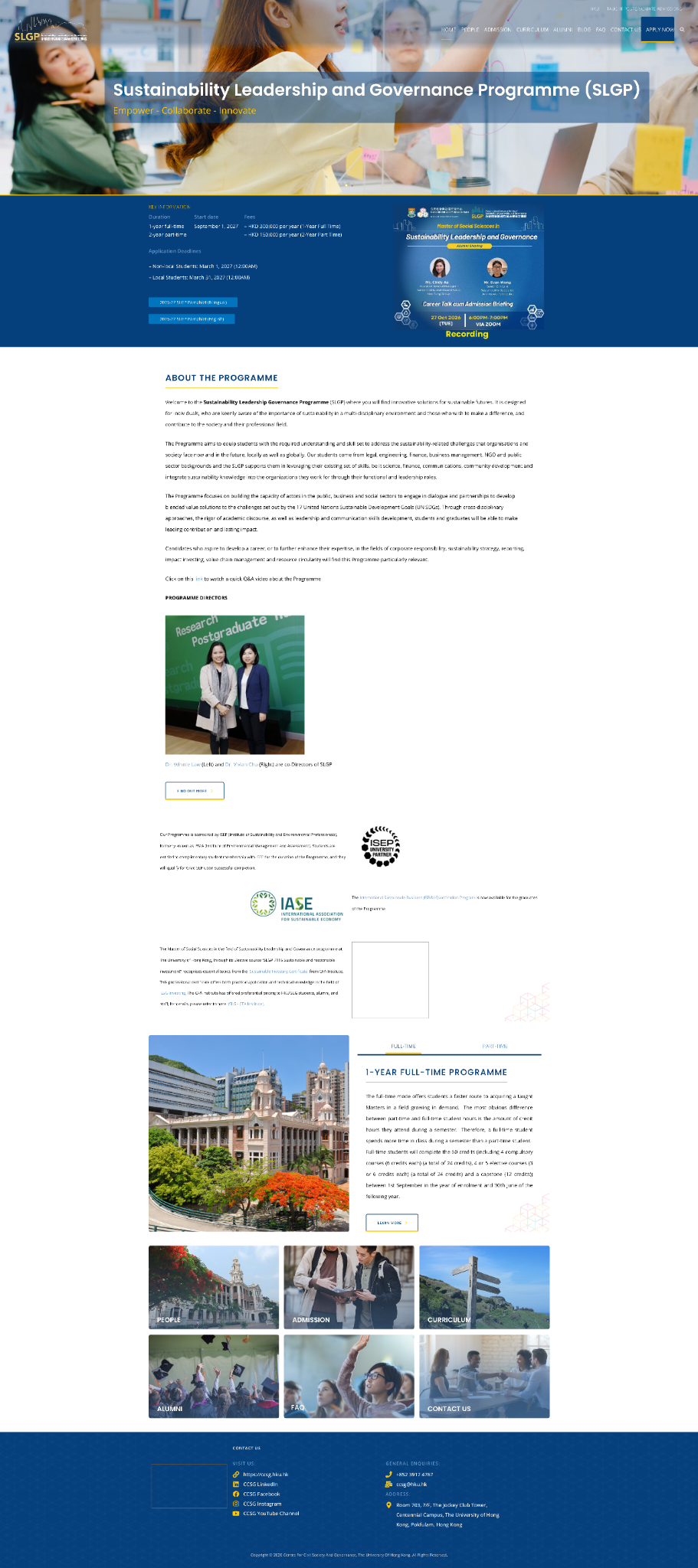
The complete homepage
The full-page view shows how these individual decisions work together: a people-led opening, a strong information band, a quieter academic introduction, study-mode content and image-led navigation. The repeated colour, spacing and section treatments give a long page a recognisable rhythm.
Delivery
What we
delivered.
- People-led programme presentation
- Clearly grouped study and admissions information
- Academic profiles and professional context
- Study-mode presentation and visual navigation