

Product Specifications on a Small Screen: Plan Useful Website Tables
A specification table should help buyers compare the right details on a phone. Plan units, headers, mobile behaviour and editable fields before squeezing a desktop grid into place.

- Start with the comparison a buyer needs to make.
- Keep units, qualifiers and product identity visible together.
- Choose mobile behaviour from real data rather than an empty grid.
- Preserve meaningful table structure and test the editor workflow.
Define the comparison before designing the grid
A product table can contain all the correct information and still be difficult to use. On a small screen, the buyer may see a value but lose the product name, miss the unit or struggle to compare two models. The answer is not simply smaller text. Start by deciding what the table is helping someone choose.
Ask sales or product colleagues for a realistic question: which model fits the available space, supports a required connection or includes a particular option? Select a representative set of products and ask what information resolves that question. This example should come from the business; invented product specifications are unsuitable for a design test intended to approve real content.
Prepare the data as carefully as the layout
Create a short field list containing the label, unit, allowed values and any qualifier. Distinguish not applicable, unavailable and not yet confirmed. An empty cell may hide a missing entry rather than mean that a feature is absent. Agree the meaning before an editor starts filling the CMS.
Keep comparable measurements consistent. If a conversion or technical interpretation is needed, have the product owner approve it. Put important conditions close to the value they affect, rather than making every buyer search a general footnote. A compact table is not useful if removing words changes what a specification means.
Prototype with the most demanding real content
Use the longest product name, a multi-line qualifier, an unusually large value and the widest set of columns the launch will actually require. Include a product with an optional feature and one with a genuinely inapplicable field. These cases reveal problems that a row of short placeholder labels will conceal.
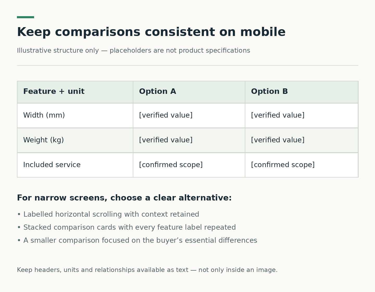
There are several possible mobile treatments. A scrollable table may preserve side-by-side comparison; a carefully structured product-by-product view may suit single-item reading; a comparison selector may reduce the number of models shown together. Each introduces trade-offs. Do not switch to cards merely because they fit: buyers may then have to remember values while moving between separate blocks.
Protect context when the table moves
If horizontal scrolling is chosen, make it apparent that more information exists. Test whether the product identity and relevant label remain understandable as the view moves. Check that scrolling the table does not unexpectedly move the entire page. Any sticky labels or columns need checking with long text and increased text size, not only the default view.
For an illustrative acceptance task, ask a reviewer to compare the same named property for two models, then find the condition attached to one value. Record where they hesitate. This is not a conversion experiment or a claim about user success rates; it is a practical way to expose missing context before development is signed off.
Keep the structure meaningful, not just attractive
W3C’s table tutorial explains that data and header cells need structural relationships so assistive technologies can convey context. A grid drawn with visual styling alone does not supply that relationship. Complex tables may require more explicit header associations than simple ones. Ask the developer to explain how the selected mobile treatment preserves them.
A caption can identify the table’s purpose. A screenshot should not be the only usable representation of important product data. The buyer’s brief should require testing of the implemented table with the agreed accessibility checks, while avoiding a blanket compliance claim based on one component. The W3C tutorial is a useful technical reference, not a substitute for project-specific review.
Test the next update before accepting the first version
Have an editor add a model, change a value, insert an approved qualifier and retire an obsolete item in a test environment. Check that the table still behaves correctly on mobile. If an editor must manually duplicate the same specification in a desktop table and a mobile card, discuss the risk of the two versions diverging.
The handover should include the field definitions, approved sample data, mobile behaviour, validation rules and named content owner. Link the table to the relevant enquiry or product detail route without forcing readers to reconstruct the model name. Miracle’s website design service can be the starting point for discussing this content and interaction brief. Its CUHK2030 case provides a separate example of a content-led website project, not a claim that it used this product-table pattern.
Plan your website project
Explore Miracle website design and development
Related project: CUHK 2026–2030 Strategic Plan
Sources and further reading
Frequently asked questions
Should every wide table become cards on mobile?
No. Cards may help readers inspect one product but make cross-product comparison harder. Test the intended task with representative content before choosing the treatment.
Can we upload a spreadsheet screenshot instead?
A screenshot alone is a weak substitute for usable specification data. It can be difficult to read, does not preserve semantic table relationships and makes updates harder to manage.
Who should approve units and technical qualifiers?
The relevant product or technical owner should approve them. Designers and developers can make relationships clearer, but should not guess a specification or remove a condition to fit the layout.
Planning something similar?
Talk to Miracle