

Your Brand Font on the Web: What the Design Handover Needs
A brand typeface needs more than a font filename. Prepare rights, language coverage, weights and fallback behaviour so the website stays readable and consistent.

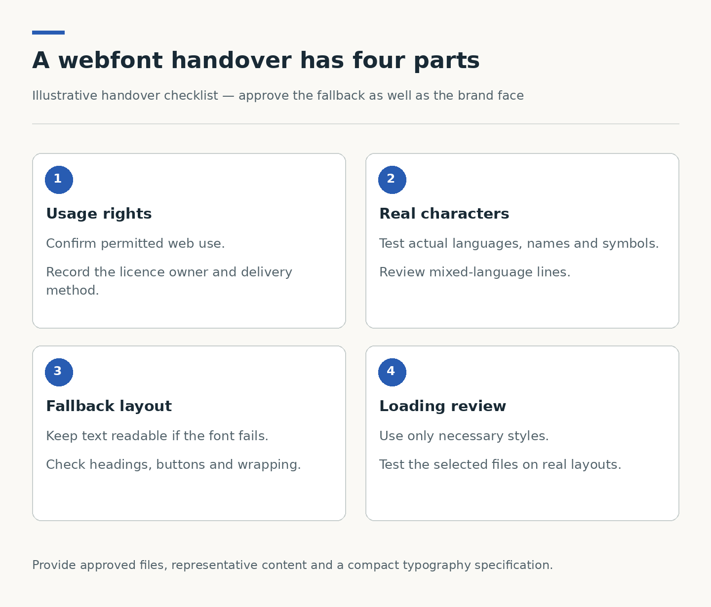
- Confirm that the supplied licence permits the intended website use.
- Test the actual languages, characters and weights used in the content.
- Approve fallback typography, not only the fully loaded design.
- Include real headings, buttons and mobile layouts in the font review.
A brand guide is the beginning, not the whole handover
A typeface can make a website feel unmistakably connected to a brand. But a font that works in a presentation or printed brochure is not automatically ready for a website. The development team needs to know which files may be used, which styles matter and what should happen before those files load. Settling these details early prevents typography from becoming a late design compromise.
Start with a small inventory: family name, approved weights, intended use, languages, source and licence owner. Distinguish the display face used for short headings from the body face used for long reading. Supplying every font in a brand folder does not mean the website should load every one. Keep this inventory beside the approved brand guide so later changes remain traceable.
Check usage rights before transferring files
Ask the person responsible for the font purchase or subscription to confirm the permitted web use. Record any domain, traffic, hosting or distribution conditions stated in that specific licence. Do not assume that a desktop licence covers web embedding, or that a file found in a shared drive can be placed in a public repository.
Give developers the approved web files or authorised delivery method, not a collection of uncertain copies. Web.dev specifically advises checking licences before self-hosting or subsetting fonts. If rights are unclear, resolve them with the supplier or choose an approved alternative; a visual match is not evidence of permission.
Test the text that the website will really contain
A sample headline containing only English letters is not enough for a multilingual corporate site. Gather realistic headings, numerals, punctuation, company names and specialist terms. Include Traditional Chinese or other required languages, currency symbols and any unusual characters. Check which typeface supplies characters that the preferred font does not contain.
Review mixed-language lines, not just separate language samples. A Chinese heading containing an English product name can expose mismatched heights or spacing. A long department name may wrap differently from the short placeholder used in a mock-up. Use real approved content wherever possible, with clearly identified test content where final copy is not ready.
Choose weights and delivery with a purpose
Every additional style should have a job. Ask whether the design genuinely needs light, regular, medium, semibold and bold, or whether a smaller set can preserve the hierarchy. Variable fonts can cover several styles in one file, but that does not make them automatically smaller for every project. Compare the actual assets and required range rather than choosing by format alone.
Font loading can delay visible text, and a change from a fallback font to the intended font can shift the layout. Web.dev explains both effects. The brief should therefore ask for readable text during loading and stable layouts, with implementation choices tested against the chosen fonts and site rather than a promised universal score.
Approve the fallback as part of the design
A fallback is not an error state to ignore. It is the typeface visitors may see while a font downloads or when a font request fails. Ask for a preview with the brand font unavailable. Check whether the replacement keeps headings legible, buttons usable and paragraphs comfortable to read.
Test constrained components carefully: navigation, cards, form labels, badges and bilingual buttons. Avoid solving overflow simply by making all text tiny. Sometimes the right correction is a wider control, a permitted line break or clearer wording. The acceptance decision should protect the reader’s task as well as the original visual style.
Make the handover repeatable for future pages
Document a compact typography system: heading levels, body style, links, labels and emphasis. Include examples of permitted use and an owner for decisions about new styles. Editors should not need to invent a font treatment each time they add an article or service page.
Miracle’s CUHK strategic-plan case includes a three-language website and content-management workflow. It is a useful reminder to consider typography across languages and editable content, although the case does not claim any particular font implementation or loading result. For your own website brief, provide representative content and approved font permissions alongside the visual references. That gives design and development a concrete basis for decisions.
Plan your website project
Explore Miracle website design and development
Related project: CUHK 2026–2030 Strategic Plan
Sources and further reading
Frequently asked questions
Can the website use the same font as our printed brochure?
Possibly, if the relevant licence permits web use and suitable files or an authorised delivery service are available. Confirm those details rather than relying on the brochure’s appearance.
Do we need a different font for Chinese and English?
Not necessarily. Test the chosen family’s character coverage and mixed-language appearance. Some projects use complementary families; the decision should follow readable, consistent content rather than a fixed rule.
Does a variable font always load faster?
No. Its value depends on the actual file and how many styles the website needs. Compare the required assets and test the result instead of treating variable fonts as an automatic performance improvement.
Planning something similar?
Talk to Miracle